top of page

Ui/Ux Design

I blend innovation with user-centric design through in-depth research and intuitive wireframing. My process focuses on responsive visuals that perform seamlessly across devices. I use an iterative approach to refine designs based on feedback, ensuring a polished user experience. With front-end development skills, I collaborate effectively with developers. Accessibility is a priority, with a minimum font size of 16px for legibility.
-
User-Centric Design & Research
-
Wireframing and Prototyping
-
Responsive and Adaptive Design
-
Design Systems
-
Design Principles
-
Collaboration and Iteration
Empathising
Following extensive research, the defining phase involved synthesising the insights, and developing focused personas, user flows and JTBD statements to guide the designing process while empathising with our users needs.
The 3 personas that were developed reflected the background research as well as our ethnography.
The first persona targeted users who due to physical and mental disorders would benefit from digitising museums
The second persona targeted education, therefore they were a student
The third persona focused poverty
The interface is being designed across desktop, mobile, and VR platforms. Each device focused on a different part of the user journey. My design work focused on creating a desktop space and explored the educational features.

User Journey and Flow
User Journey

User Flow

Wireframing + LoFi Prototypes
In the initial stages of the UI/UX design process, we began by creating sketched wireframes, allowing for rapid idea generation and early-stage concept exploration. These sketches were iterated in short intervals, helping us quickly gather insights and refine our ideas. As the concepts matured, we transitioned into digital wireframes, where designs became more thought-through, focusing on both usability and user-centered design principles.
Throughout this iterative process, I continuously reflected on design decisions, ensuring each feature was crafted with the end user in mind. Additionally, I actively sought team feedback to improve the wireframes. You can see some of those annotations below, categorized in red for areas needing further work, green for elements that are functioning but require adjustment, and blue for UI patterns that were incorporated into the design.
Screen 1


- Separating icons into global navigation bar and tools bar for separate features
- The second iteration feels messy; the catalogue “folder” takes too much space on the screen, does not reflect museum classy identity
Screen 2


- Introduced a split screen ui pattern to display multiple information; live robot footage (always keeping immersive experience on screen) and additional educational information about artwork (Babich, N. 2017)
- Gutenburg Principle - placing information window on the left instead of right to keep valuable information on the left, and least important information in the dead zone (bottom-left side of screen. (Lundgren, A. n.d.).
- Module tab design pattern - navigation bar of this widow has multiple sections, when you're looking at a specific section that section is highlighted (UI Patterns. n.d.)
- Decision to add liking option to create a more engaging and immersive experience
Screen 3

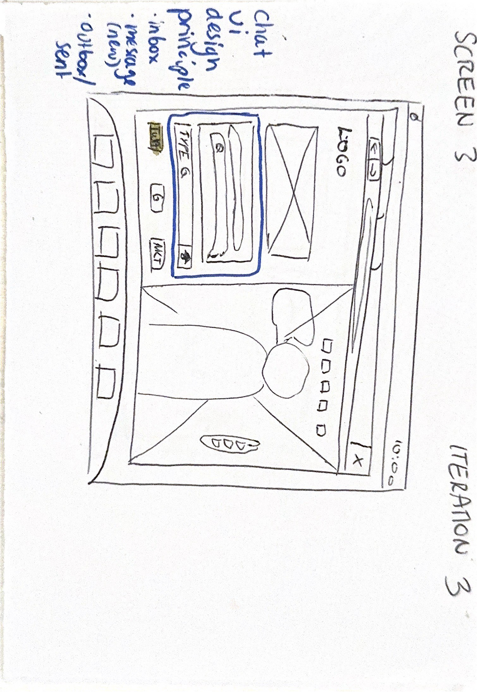


- Chat ui design principle - 3 elements; inbox, message (new), outbox sent t
- Problem: opening notepad is not intuitive or takes up unnecessary space on screen
Screen 4


- Decision to create a distinction between different types of recommendation to create a more personalised choice making process
Screen 5


- Decision to create a distinction between different types of recommendation to create a more personalised choice making process
The branding section of this project showcases how we developed a unified visual identity across all platforms. Our goal was to create a consistent user experience that reflected the brand’s core values, while ensuring adaptability across different devices—desktop, mobile, and VR. This section highlights the careful consideration given to typography, color schemes, button styling, and overall visual hierarchy, all of which play a crucial role in reinforcing the brand’s presence and user engagement.
Through the creation of a comprehensive design system, we ensured the brand’s visual consistency and flexibility across diverse interfaces.
Color Styles

Burnt white is used as a background color. It is subtle yet elegant reflecting museum antiquity and maturity.
Our black color has a faintly grey tone to make it more easy on the eyes. Used for text to make everything clear and classy.
One of 2 two core colors is a bright orange. A more exciting and modern take on a traditional and refined brown often associated with museums. Used for selected buttons, distinctive areas and to for differentiation.
Our cream color is used to add verity while keeping the design clean.
Light green serves as our highlight color, bringing a touch of freshness and vitality to our online museum interface. It guides visitors smoothly through the digital experience, emphasising interactivity and enhancing user engagement with a modern, clean aesthetic.
Shades

Tints

Button Styles
Default
Selected
Hover
As part of the design system creation, we focused on ensuring button branding remained consistent across various devices, including desktop, mobile, and VR. To achieve this, we developed a cohesive styling guide that defined button size, stroke width, stroke curve, color palette, and interaction states (hover, active, disabled). This ensured that the user experience remained unified and intuitive, regardless of the platform.
By standardizing these elements within the design system, we were able to maintain a seamless visual identity and interaction consistency, ensuring that users would have a familiar and intuitive experience across all devices.
Text Styles
Titles
Headings
Subheadings
Detailed information
Location information
Paragraphs
Monda
Monda
Design Systems

Throughout the project, I prioritized gathering feedback and testing designs to ensure optimal outcomes. I conducted heuristic evaluations with four experts, allowing for targeted insights on usability and functionality. Regular meetings with the creative director (teacher) provided ongoing guidance, ensuring alignment with project goals. Although I am familiar with tools like Loop11 for user testing, I ran out of time to conduct full user tests. Nonetheless, the feedback from experts and continuous iteration helped shape a well-refined design that meets user needs effectively.
Heuristic Evaluation Insights
Communication and visibility features
-
Toolbar functionality is confusing due to the icons and reason for being there, as normally desktop websites have the main controls in the top menu bar
-
Navigation arrows are not noticeable
-
Allow for more breathing space, especially in the artwork annotations (artist, artwork, date, location etc.)
-
Communicating the action scrolling better
Starting Point
-
The first screen is confusing, there is no clear start point of actions
-
Confusion about info icons
Notes
-
No way of deleting notes
-
Confusing function as user is not sure what will happen to the notes afterwards
Create Director Feedback
-
Work on creating more space and decluttering
-
At times the design doesn’t feel classy enough for a museum
-
Think about adding another screen directing users to their expectations better
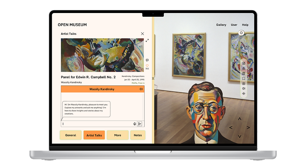
OPEN MUSEUM
Our digital solution offers virtual tours of museums all around the world, through desktop, phone and VR. Based on our research we found that our target users are people with disabilities, physical and mental, students, and people who cannot afford to travel. Therefore, our users can access any museum in our catalog from anywhere in the world, through a simple online booking system, there is a strong focus on educational features and the ability to curate your ideal tour as you're exploring the museum.
Background Research
In the initial phase of the product design project, we conducted extensive background research to establish a well-rounded understanding of telepresence technologies and their application in museum spaces. This research encompassed a diverse array of sources, including academic articles on immersive user experiences, news articles highlighting emerging trends in virtual museum tours, and interviews with stakeholders such as museum professionals and potential users. By combining insights from scholarly research with real-world perspectives, we ensured the solution was not only innovative but grounded in the practical needs and aspirations of the users.
Below you can find the key research which influenced our design process:

Conclusions
People go to museum for education
Museums can be overwhelming due to their size and large amounts of people
Museums are an immersive experience - the building and exhibition design matters too
Traveler's are biggest audience for museums
Temporary exhibitions are difficult to attend in museums due to location
Organisation is well valued in museums
Music is a great asset in museums counteracting overwhelming environment
Museums can be difficult to navigate
Online Ethnography
To create a product that truly resonates with museum-goers and addresses their needs, we conducted ethnographic research aimed at understanding their behaviors, pain points, and desires. We explored various online platforms, including comments, posts, and reviews, where visitors shared their experiences and frustrations with physical and virtual museum visits. By analyzing this data, we gained insights into the challenges faced, such as accessibility, engagement, and information delivery. This allowed us to empathize with museum-goers and design a virtual experience that not only solves these issues but enhances their overall interaction with art and culture in a meaningful way.

Competitors
We examined a wide array of indirect competitors as existing telepresence robot solutions are not available in the market at the moment. Our focus was on platforms which allow for users to explore locations through a camera. This includes robots for purposes other than museums, drones and existing virtual museum tours.

Key Insights
Existing solutions are limited to basic interactions but don’t explore more engaging features
Real-time movement and engagement creates a more entertaining and immersive experience
Existing solutions don’t encompass a well-rounded experience (both interactivity and information strong)


Case Study
Robots, Reps and Reinvention
Background
Telepresence robots are a type of social robot that enables a person to interact with a physical environment and people in a remote location. They provide a virtual presence for people as if they were physically in this location. These robots typically have a screen, camera, speakers, and microphones to facilitate two-way audio and video communication. The remote person can control those robots through digital interfaces across various digital devices. This enables the user to move the robot around, look around the room, and even participate in meetings, classroom activities, or any event where physical presence is needed but not possible.
Challenge
Design a user interface that allows museums to welcome remote visitors through a telepresence robot.
bottom of page